Writer's Guide
Folder structure
.
├── components
│   └── index.js (exports all components)
├── docs (most of your work happens here!)
│   ├── _templates (templates for specific topic types)
│   │   └── tutorial.mdx
│   ├── category
│   │   ├── _category.yml_ (a category configuration file)
│   │   ├── topic1.mdx
│   │   └── topic2.mdx
│   └── intro.mdx (the documentation "home page")
├── src
│   ├── css
│   │   └── custom.css (custom styles)
│   └── pages (general / non-docs pages)
│       └── writers-guide.mdx (accessible at /writers-guide, you are here :P)
├── static (contents served directly under the base url
│   └── img (images)
│       ├── drawio-diagrams (images that contain DrawIO metadata)
│       ├── excalidraw-diagrams (same as DrawIO, but for Excalidraw)
│       └── logo.svg (the Server State logo)
└── docusaurus.config.js (configures the page in general)
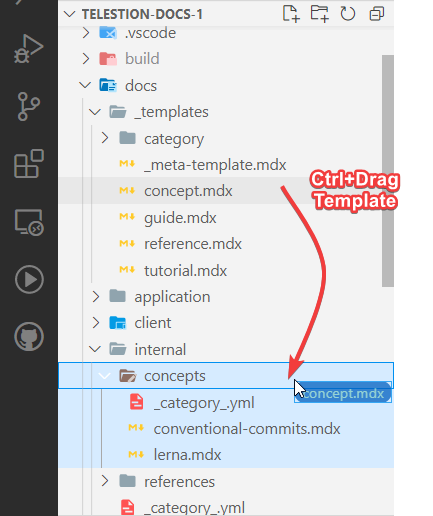
The _templates folder contains templates for all commonly used page types of
the documentation.
All templates, aside from laying down a general structure that you have to fill in, contain a few things to get you started:
- Guidelines for when to use the template
- Relevant component imports and copy/pastable snippets that might be useful for the topic
- Writing tips for the type of content the topic is for
To use a template within VSCode, simply Ctrl+Drag it into the relevant folder, rename it, and adjust it to your liking:
General Writing Guidelines
- Write in the present tense
- Use neutral pronouns (they/them instead of he/she and him/her)
- Be respectful to everyone
- Be aware of the potential for cultural misunderstandings
Docusaurus Markdown Components
Docusaurus provides a bunch of additional functionality within our Markdown documentation.
For all details, please refer to their excellent documentation:
Docusuarus Docs regarding Mardkown »https://docusaurus.io/docs/markdown-featuresAdditionally, we'll describe essential elements here, as well:
Code Blocks
Code:
```java title='MyClass.java' {3}
class MyClass {
    MyClass(String message) {
        System.out.println(message);
    }
}
```
Result:
class MyClass {
    MyClass(String message) {
        System.out.println(message);
    }
}
Admonitions
Code:
:::note Optional Title

Content

:::

:::tip Optional Title

Content

:::

:::info Optional Title

Content

:::

:::caution Optional Title

Content

:::

:::danger Optional Title

Content

:::
Result:
Content
Content
Content
Content
Content
Custom MDX Components
Apart from the elements Docusaurus natively provides, there are also a few custom components for the Server State documentation:
<Grid />
Allows to display several block elements next to each other, especially useful
in combination with <Reference />
Code:
import { Grid } from '/components';

<Grid cols={2}>

:::danger First note

Note content

:::

:::caution Another Note

Note content

:::

</Grid>
Result:
Note content
Note content
<Reference />
Code:
import { Reference } from '/components';

<Reference to="https://docusaurus.io/docs/markdown-features">
    Docusuarus Docs regarding Mardkown
</Reference>
Result:
Docusuarus Docs regarding Mardkown »https://docusaurus.io/docs/markdown-features<FileDownload />
Code:
import { FileDownload } from '/components';

<FileDownload file="/img/logo.svg">XD Template</FileDownload>
Result:
XD Template<Image />
Code:
import { Image } from '/components';

<Image src="/img/logo.svg" />
<Image src="/static/img/logo.svg" /> <!-- identical -->

<Image src="/img/logo.svg" alt="Server State Logo" />
<Image src="/img/logo.svg" invertible />
Props
| prop | description |
src: string | May include `/static` (this gets handled automatically) |
invertible: boolean = false | Whether the image may be inverted for the dark theme |
... | All other props get passed to the ` |
Result:
Markdown content inside MDX components
To write Markdown content inside MDX components, leave a blank line before and after your content and do not indent the content:
<MyComponent>
    <MyChildComponent>

Some Markdown Content

    </MyChildComponent>

</MyComponent>
Static Assets (images, videos and other files)
Static assets are stored within the static folder and served at the root of
the repository, i.e., an image in static/img/logo.svg can be referenced using
/img/logo.svg.
Including an image
Images with a big file size affect the page's load time and, through that, also the search engine ranking. Therefore, when your image is bigger than 500 kB, try to reduce its size with these steps before using them:
- For diagrams and other "illustration-like" images, consider using a vector format (SVG)
- Consider what size the image has to, reasonably, be displayed at, and reduce the image's dimensions if necessary.
- Run your JPEG and PNG files through https://tinypng.com/ to reduce their file size without changing the image itself
To include an image, you can use the <Image /> component from above:
Code:
<Image alt="Description of the image" src="/img/logo.svg" width="200" />
Result:
Images and dark mode
If your image has no problems with being inverted (light becomes dark and vice
versa), you can set the invertible attribute and allow the website to invert
them when users open the website in dark mode:
One example of a well-supported image type is a diagram that only contains black text/shapes on a white/transparent background.
Code:
<Image
    src="/static/img/drawio-diagrams/conventional-commits/conventional-commits-decision-table.drawio.svg"
    invertible
/>
Result:

(switch to dark mode to see the effect)

